By,
Ms. Gesu Goley, Ms. Anjali Prajapati
B.Design (Foundation- Sem II)
Satyam Fashion Institute, Noida
The Principles of design describes how artists use the elements of art in a work of art. How these principles are applied affects the expressive content or the message of the work.
The principles are mainly of 7 types: –
- Pattern
- Contrast
- Emphasis
- Balance
- Proportion/Scale
- Harmony
- Rhythm/ Movement
As an exercise, we worked on this module of learning about these principles and understand their application in the products/ objects/ fabrics around us. So, let us go through a tour to some of these principles, we observed –
PATTERN
It implies a regular arrangement of alternated or repeated elements (shapes, lines, colours or motifs). The pattern is created by the repetition of similar elements. Repetition with variation is very interesting, which creates an eye-catching effect. The human eye attracted by beautiful motif/design, and our eyes are naturally inclined to notice motifs. The pattern is not only created on fabrics but it can also be created in architecture, textile, interior or other artworks.
 Fig 1: Repeated patterns are seen in Home furnishings and Apparels
In these pictures, one thing is common, i.e., repeated patterns; like in bedsheet and saree borders, the triangular patterns were repeated. While in this t-shirt, stars were repeated, and in curtains, different types of motifs were repeated.
BALANCE
A feeling of balance results when the Elements of Design are arranged symmetrically or asymmetrically to create the impression of equality. Balance is of two types;
- Symmetrical
- Asymmetrical
A feeling of balance results when the Elements of Design are arranged symmetrically or asymmetrically to create the impression of equality in weight or importance. Balance in design is similar to balance in life. The balance comes from the similarity in shape, size, texture or colour. Through balance, we can add aesthetic appeal to any artwork/composition.
 Fig. 2: Different household articles with the principle of balance
Let us take the example of the above Lizol bottle, which is asymmetric in its shape because it is not equal from both sides, while on the other hand, the Vaseline bottle is symmetrical because both sides were equally distributed. We can see the symmetric balance in scissors, ear pad, cupboard, bottles and washbasin. Both types of balance create different effects in the design/ product elements.
EMPHASIS
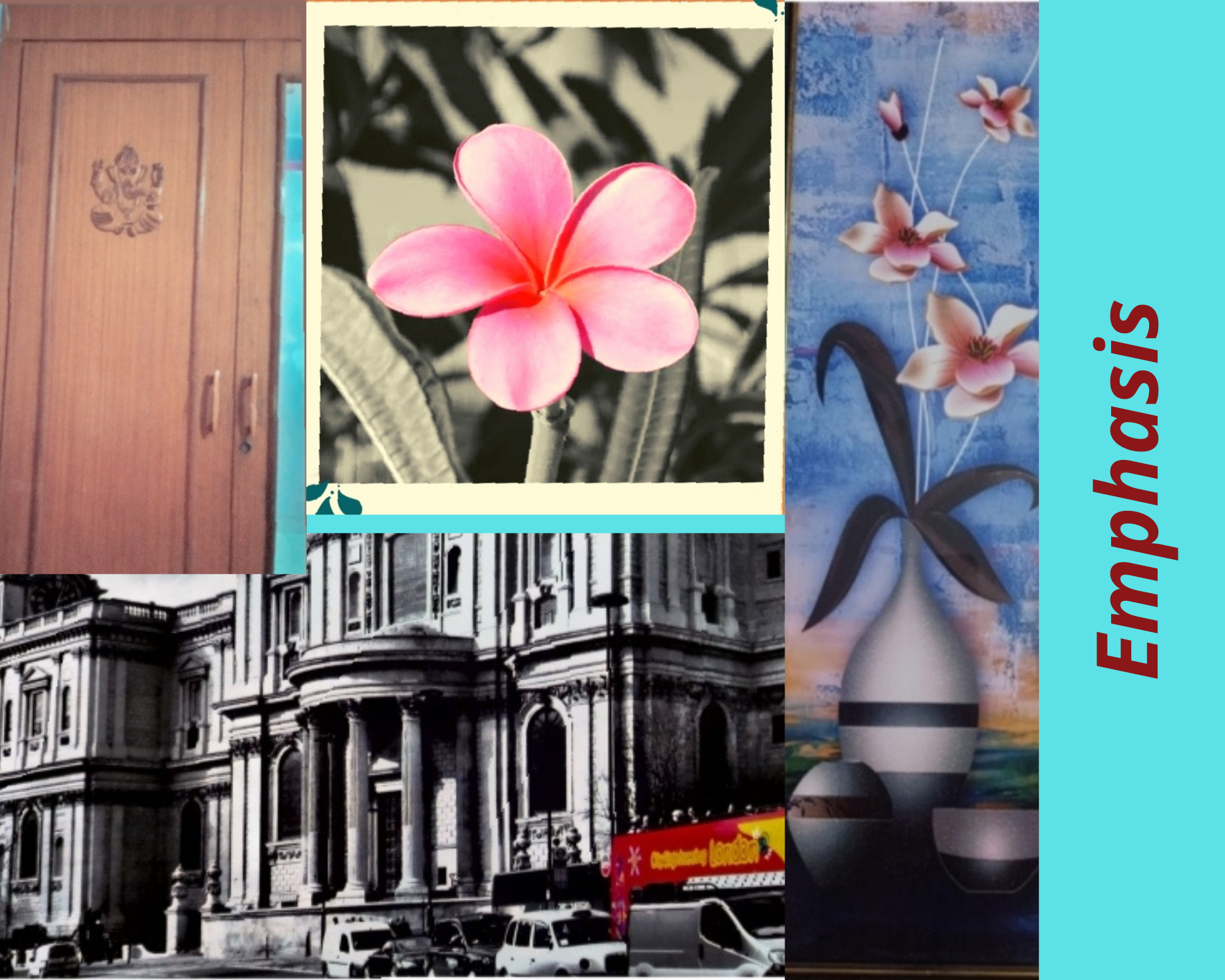
When special attention is given to one part of a work of art (for example, a dark shape in a light composition), we see a point of emphasis that stands out. Emphasis can be achieved through placement, contrast, colour, size, repetition related to focal point etc. In the collage below, we can observe special attention given to something in items like in the Almirah a central motif has been carved on a plain background; in the photograph, the flower is standing out of a blurred backdrop, and in-wall painting and in the building drawing, some accent colour has been used against grey tone creating emphasis.
 Fig. 3: Use of Emphasis in different products and paintings
RHYTHM
It implies the use of recurring elements to direct the movement of the eye through the artwork. There are different kinds of rhythm: random, regular, alternating, progressive, and flowing. Rhythm is the way the elements are organised to lead the eye to the focal area. Movement can be directed, for example, along edges and through shape and colour.
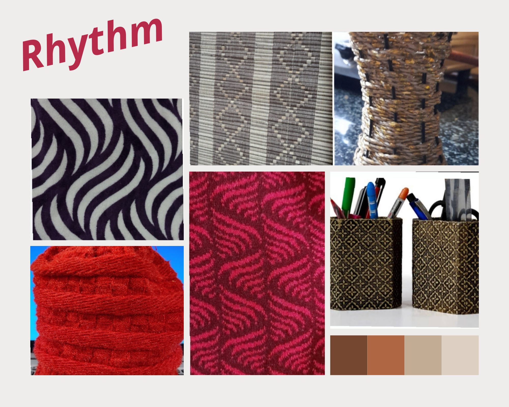
In the picture below, there is a regular repetition of one thing or the other to create a sense of movement through our eyes, such as movement of lines, shape, form and motifs or other artworks. Through repeated elements, we can create a sense of flow, just like seen in musical notes. Rhythm makes us think about what comes next!
 Fig. 4: Application of rhythm in different articles
The different kinds of repeating lines (curvy, horizontal, vertical and diagonal)and some motifs were repeated in rhythm (in sequence) in these images.
In this group exercise, all the foundation students B.Design programme learned a great deal about applying all the principles of design. We could summarise a few of our works through this blog. We hope that it will be an exciting read!
Keywords: Principles of Design, Pattern, Balance, Emphasis, Rhythm